Not so long ago, we brought you news of a new study — built on the work of researchers and collaborators from Columbia’s School of International and Public Affairs, the Earth Institute at Columbia University, and the New York City Mayor’s Office of Long-Term Planning and Sustainability — that offers an unprecedented level of information concerning energy use in New York City across the five boroughs. Now all that data has been made available to the public in the form of a handy online tool designed to help city planners, building managers and home owners alike get a handle on their energy usage.
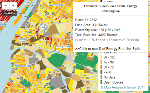
The tool makes use of ZIP code-level energy consumption data to estimate the average annual energy use for every tax lot at practically the level of the building throughout the entire city — a gargantuan feat, accomplished by first building a map using data gathered by the Mayor’s Office of Long-Term Planning and Sustainability for electricity, natural gas, steam and fuel oil usage, then estimating individual property energy use based on floor area and function. In this way, the actual energy use of each building has not been made public, but a wealth of useful information is now available for those looking to identify opportunities to save cash and carbon through energy efficient technologies.
The study that led to the development of this tool was led by Ph.D. student Bianca Howard, working under the direction of Professor Vijay Modi of the Earth Engineering Center, a center of the Earth Institute at Columbia University. “We wanted to get some understanding of the basis of how energy is distributed around the city,” Howard explained, in a statement, “so we can find out how we can locate sources of energy generation by the need.” She went on to explain that this included looking at more localized sources of power, such as locations where solar-generated electricity, solar hot water systems or wind power might work well.
Modi added, “The simplest thing we learned [from the map] was that there are possibilities for doing lots of things which are hard to see when you don’t look at the big picture. For instance, neighboring buildings with large energy demands could team up to install cogeneration systems, which use heat generated from electricity to heat the buildings, cutting energy use.”
The next step on the horizon for this project will be to upgrade the map to allow individual building owners to enter their actual energy use information online and use this to compare how their energy usage measures up against their neighbors, and buildings of similar size and function in and around the five boroughs. This kind of data will serve to make the map more accurate, allowing researchers to improve the model they use to estimate energy use in other buildings.
The interactive map is available online.